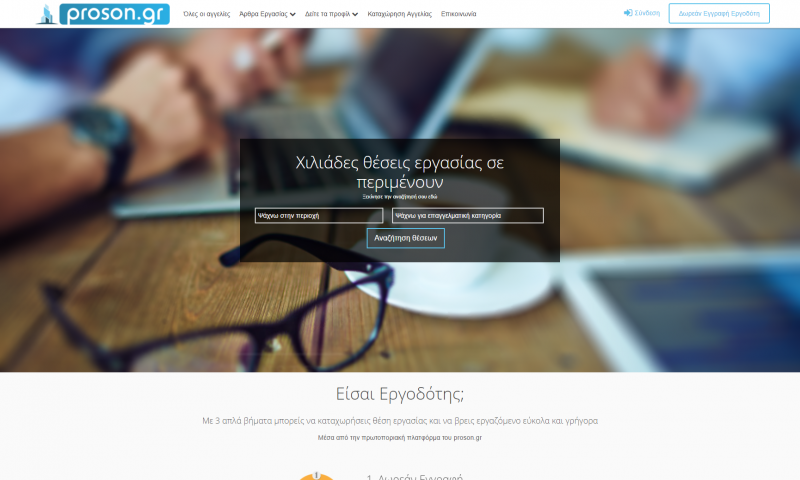
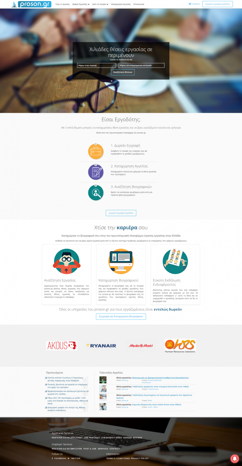
Proson
Challenge
After proson.gr made it to the top 3 career websites of Greece it needed a whole new UX strategy in order to allow it to grow even further.
Approach
After looking at the whole analytics dataset, we analyzed all possible user flows and created some scenarios and hypotheses which in turn where tested through A/B testing.
Requirements galore
Technically this website was one of the most complicated websites we've ever built.
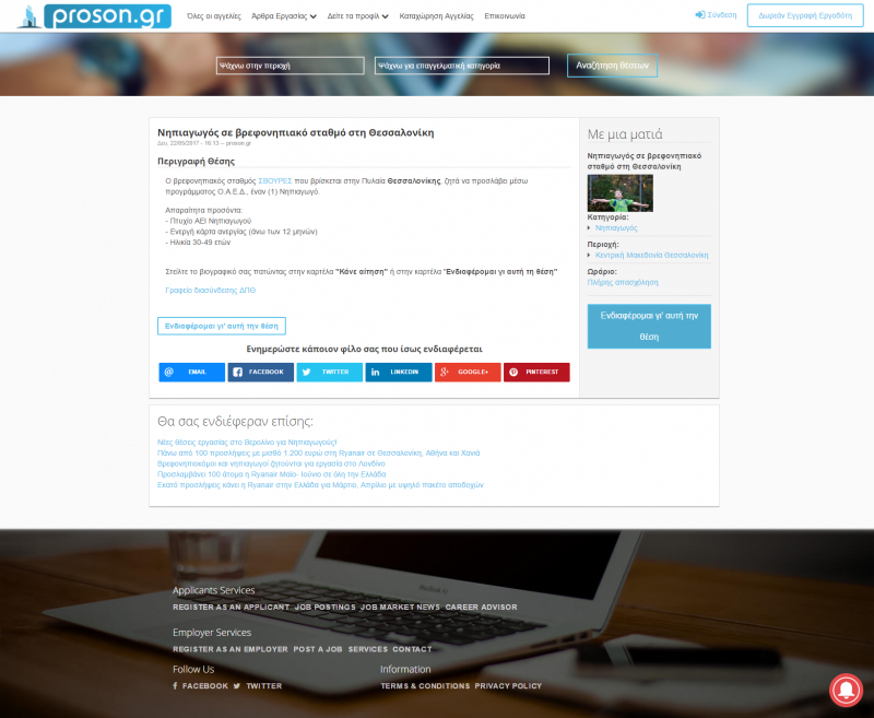
There had to be a 2 complete separate web applications, one that would allow job seeking users to create and maintain a complete profile of their skills and one for businesses to be able to register and buy job ads. All within one website application.
For the job seeking users there had to be many automation tools, like automatic matching and notifications for jobs that might interest them. This was accomplished by a series of smart modules developed from our developer to actually learn the skills of each applicant and match them with required skills of employers. Other automations include automatic emails and notification of only relevant jobs to each individual job seeker.
Companies on the other hand had totally different needs. They needed to be able to complete their profile, buy ads and scan CVs and users skills very quickly. To address those needs we created a very sophisticated skill matching feature that would only show relevant applicants with the right skills for them. We have also developed an e-commerce function completely integrated within the company profile for buying ads for the website.
Design Decisions
When designing proson.gr we wanted to invest to the UX capabilities of the whole system.
We had a canvas full of user profiles and flows. The challenge is that design should stay out of the way and let the users perform exactly what they want in the most intuitive way, without even thinking about it. Our front end developer used all known UX best practices that are validated through many experiments worldwide and we also run a few tests of our own.
The result was a very clean interface that everything is where you expect them to be and all the information is right at your fingertips.
Do you want to see more?