Codebender

Problem
Codebender had a very high traffic landing page and fanbase. Their metrics showed low conversion rates which in turn indicated a UX problem. They asked for our help on designing a better landing page.
Approach
We looked at the vast amount of data codebender had and after running some tests we found out a few solutions to test our hypotheses. After lots of A/B testing we found the new landing page to perform better.
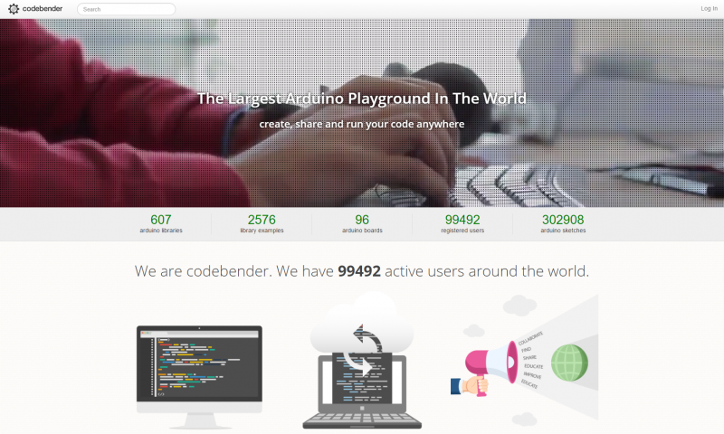
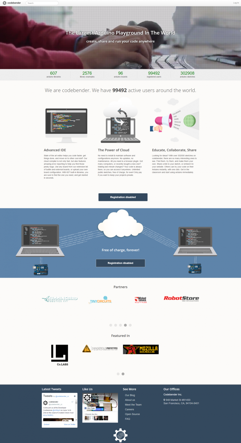
A Better Bender
This was a tough one. Tough because we had a very specialized target group that were mostly not interested about design. But we also had data suggesting that visitors experienced some barriers in their journey to sign up and become codebender users.
We focused our UX efforts around two major things. On the old page it wasn't really clear what exactly is this platform / tool so lots of people were just signing up to see what its all about and then drop off because its not what they thought it'd be. The other thing was that by the time we got involved, codebender had a very big community and a huge library with code snippets for arduino modules that could enable beginners and non-geeks to play with arduinos or create something basic using code found there. This had to be communicated!
We created a new landing page for codebender using all our UX wizardry focusing on our hypotheses and beliefs about their target group. We tested the 2 pages for quite some time using A/B testing and we found that the new page had better conversion rates from the old.
Do you want to see more?