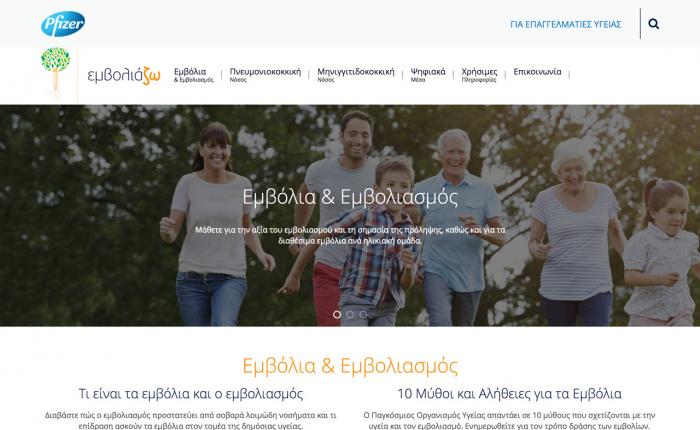
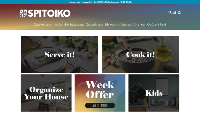
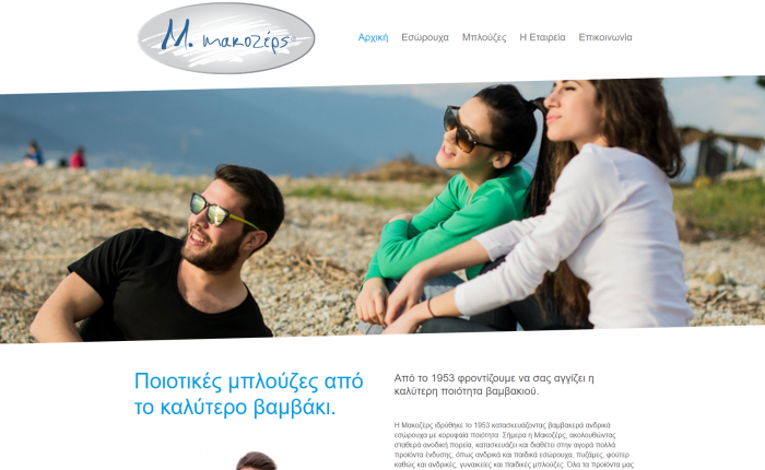
A website redesign is easy to see. New colours arrive, typography sharpens, photographs get larger, cards line up, and the old header finally disappears. Everyone involved can point to the difference. That visibility is comforting. It makes the project feel concrete.
The commercial problem that triggered the redesign is usually less tidy. Enquiries have slowed. Paid traffic has become expensive. Customers reach checkout and leave. The sales team says the website sends weak leads. The owner feels that the business looks smaller online than it really is. Somebody has heard that the site “looks old,” and the phrase becomes the diagnosis.
Sometimes the diagnosis is correct. Visual age can damage trust, especially when competitors present their offers more clearly. But a redesign can also become an expensive way to avoid a harder question: why are people not acting on the current website? If that question is not investigated before design begins, the new site may win compliments while reproducing the same conversion problems in cleaner components.
This article explains how to approach a website redesign with conversion rate improvement in mind. It is not an argument for ugly websites or endless analysis. It is an argument for treating design as a business intervention. Before changing the curtains, find out where the shop is losing customers.
A redesign request usually hides a business question
“We need a new website” is rarely the whole brief. Underneath it sits one or more business questions. Why do visitors not understand our offer? Why are mobile users abandoning checkout? Why do our campaigns bring traffic without qualified enquiries? Why does the sales team keep explaining information that should already be clear? Why do customers call to ask whether the business is legitimate?
These are not purely visual questions. They involve positioning, content, traffic quality, measurement, performance, usability, accessibility, technical reliability, trust and operational follow-up. A new interface may help several of them, but only if the redesign is built around the actual causes.
The first job is therefore translation. Turn “make it modern” into observable outcomes. Perhaps the objective is more completed quote requests from service pages. Perhaps it is fewer abandoned checkouts on mobile. Perhaps it is a higher proportion of enquiries for a profitable service rather than more leads in general. Perhaps it is fewer support calls about delivery and returns. A redesign becomes easier to judge when the business can describe what should change after launch.
Conversion is not always a sale
For an ecommerce store, the main conversion is usually an order, but even there the journey contains smaller commitments: using search, viewing a useful category, choosing a variation, adding to basket, checking delivery information and beginning checkout. For a B2B company, the valuable conversion might be a qualified consultation request, a specification download or a call from the right type of buyer. For a restaurant, clinic or local service, it may be a booking, a direction request or a phone call during opening hours.
If the team defines conversion too loosely, it can optimise the wrong behaviour. More form submissions may look successful until sales discovers that most are irrelevant. More add-to-basket events may hide that delivery costs only appear at the last step. More time on page may mean engagement, or it may mean that people cannot find the answer.
A serious conversion diagnosis names the action, the audience and the business value. “Increase conversions” becomes “increase completed mobile quote requests from organic visitors on our two priority services without reducing lead quality.” That sentence is less glamorous than a mood board. It is far more useful to a designer.

Start by checking whether the measurement can be trusted
Teams often open an analytics dashboard and assume it describes reality. It may not. Events can fire twice, forms can complete without a success event, consent settings can remove large parts of the picture, payment redirects can break attribution, and internal traffic can pollute reports. A redesign based on unreliable measurement is diagnosis using a broken thermometer.
Before drawing conclusions, verify the important events manually. Complete the journey on real devices. Submit the forms. Test the phone links. Place a test order if appropriate. Confirm that the analytics platform records each step once and that campaign parameters survive the journey. Check whether cross-domain payments, booking tools or embedded forms create gaps.
This does not require a perfect data warehouse. It requires enough confidence to distinguish a real customer problem from a tracking problem. If the business cannot see where people enter, hesitate and complete, measurement repair may be the highest-value first phase of the redesign.
Look for patterns, not one dramatic number
An average conversion rate can hide the entire story. Desktop may perform well while mobile collapses. Brand search may convert because visitors already trust the company, while paid social traffic lands on a generic page that does not match the promise. Returning customers may navigate easily, while first-time visitors cannot understand the categories. One country, device or payment method may carry most of the abandonment.
Segment the journey by device, source, landing page, new versus returning visitor, product or service group, and any other dimension that reflects how the business actually operates. The goal is not to create fifty charts. It is to find differences that suggest a cause.
Suppose checkout completion is healthy on desktop and poor on mobile. A visual rebrand is unlikely to be the first answer. The diagnosis might point to a slow address lookup, an obstructive cookie layer, an awkward keyboard type, a payment button pushed below the fold or a third-party widget covering the error. Those are design problems, but they are precise design problems.
Quantitative data tells you where; observation helps explain why
Analytics can show that people leave a page. It cannot reliably tell you what they thought. This is where session observation, usability testing, support conversations, sales notes, search terms and customer questions become valuable.
Watch a small number of real users attempt the important task. Do not guide them through it. Ask them what they expect before they click. Notice the words they use. A customer may skip the button the team considers obvious because it looks like a decorative panel. A buyer may reach the pricing page and leave because the unit is unclear. A visitor may distrust a form because it asks for information before explaining what happens next.
Speak to the people who handle calls and messages. They often know the website’s missing content by heart. If ten customers a week ask the same delivery question, that is not merely a support problem. It is evidence. If sales repeatedly receives enquiries outside the service area, the page has failed to qualify. If customers send screenshots asking where to click, the interface has already delivered a usability report.
The offer may be the problem, not the interface
Conversion work becomes uncomfortable when the page is clear and the offer is still weak. A redesign cannot manufacture customer value. It can make an existing offer easier to understand, compare and trust, but it cannot rescue unclear pricing, poor availability, an uncompetitive proposition or a promise the business does not support operationally.
This is why conversion diagnosis must include the commercial layer. Does the page explain who the service is for? Does it show the outcome rather than only the process? Are important limitations visible before the customer invests time? Are delivery, returns, timing, support and next steps clear? Is the call to action appropriate for the commitment being requested?
Sometimes a “design problem” is a mismatch between the advertisement and the landing page. The ad promises speed; the page opens with company history. The search result suggests a specific service; the landing page forces the visitor to decode a broad catalogue. The campaign attracts price-sensitive buyers; the page never explains the premium. No palette change can repair a broken promise between click and page.

Trust is built from details the redesign brief may ignore
Customers do not experience trust as a single badge. They assemble it from dozens of details: a current copyright date, consistent contact information, credible photography, clear delivery terms, readable returns, working links, sensible errors, secure payment behaviour, recent reviews, transparent company details and language that sounds like somebody takes responsibility.
A visually impressive site can still feel unsafe. Stock photographs may contradict the business. Testimonials may be vague. Contact details may be buried. The checkout may suddenly change domain. The form may fail without confirmation. A discount popup may arrive before the visitor understands the product. Each detail is small; together they decide whether the customer continues.
During diagnosis, list the trust questions a first-time visitor is likely to have at each stage. “Is this business real?” is only the beginning. Customers also ask whether the product fits, whether delivery is predictable, whether support will answer, whether returns will be painful, whether a quote request will trigger endless calls and whether payment is safe. Good design answers without making the user work.
Performance is part of conversion design
A beautiful page that arrives late is not beautiful to the person waiting for it. Page speed influences more than a technical score. It affects the rhythm of the journey. Slow filters make comparison feel broken. A delayed button creates duplicate clicks. Layout shifts move the control just as a thumb approaches. Heavy scripts punish mobile visitors on ordinary connections.
Performance work should begin before the final design is approved, not after every animation and asset has been added. Set budgets for images, fonts, scripts and third-party tools. Test prototypes on realistic mobile devices and network conditions. Question each external widget. A tool that adds marketing functionality but delays the product page may cost more attention than it creates.
The useful performance question is not “did we get 100?” It is “can the target customer complete the valuable task without waiting, confusion or accidental action?” A redesign should make the business feel more responsive in both senses of the word.
Accessibility exposes fragile design decisions
Accessibility is often treated as a compliance task added near launch. In conversion terms, it is a test of whether the interface survives different ways of seeing, moving, reading and understanding.
Can the journey be completed with a keyboard? Does focus remain visible? Are form labels clear? Do error messages explain how to recover? Does colour carry meaning on its own? Can text resize without destroying the layout? Are controls large enough for a hurried thumb? Does a screen reader encounter useful names and a logical order?
These checks improve the experience for more than a narrow group. Clear labels help everyone. Predictable focus helps power users. Good contrast helps people outdoors. Useful errors help customers under pressure. Captions help people in noisy places. Accessibility is not separate from conversion design; it reveals whether the journey depends on ideal conditions that many customers do not have.
Forms and checkout deserve their own diagnosis
Forms are where many redesigns become generic. The fields receive rounded corners, but the business keeps asking for unnecessary information. The error messages change colour, but still do not say what to fix. The progress indicator looks elegant, but delivery cost remains a surprise.
Review every field with the person who uses the data. Why is it required now? Can it be inferred, selected later or requested after the first commitment? Does the customer understand the format? What happens when autofill behaves badly? Is validation helpful or punitive? Does the form preserve entered information after an error?
For checkout, examine the entire confidence sequence: product certainty, stock, price, discount logic, delivery options, arrival expectations, returns, payment methods, security signals and confirmation. A customer who abandons at payment may have begun doubting three screens earlier. The last recorded step is not always the place where the problem started.
Turn evidence into testable redesign hypotheses
Diagnosis should not produce a graveyard of observations. It should create a set of hypotheses that guide design. A useful hypothesis connects evidence, a proposed change and an expected result.
For example: “Mobile visitors landing from paid search abandon the quote form after the project-details field. Support interviews show that customers do not yet know the technical answer. If we replace the free-text requirement with guided options and explain that an estimate is enough, more qualified mobile users will complete the request.”
That statement gives the designer a problem to solve without prescribing the exact interface. It also gives the team something to evaluate. Compare it with “make the form modern,” which offers neither direction nor a definition of success.
Prioritise hypotheses by potential impact, confidence in the evidence and effort. Some changes belong in the redesign. Some can be tested on the current site first. Some require a content or operational decision rather than a visual one. This prevents the project from becoming a container for every request the organisation has postponed.

A conversion-aware redesign brief is different
A conventional brief often lists pages, features, preferred colours and competitor examples. A conversion-aware brief also states target audiences, valuable actions, current friction, evidence, measurement requirements, technical constraints and post-launch ownership.
It should explain what must remain true. Existing search visibility may depend on URLs, content depth and internal links. Integrations may support fulfilment or lead routing. Legal content may need approval. Analytics events must survive the migration. Accessibility and performance targets should be explicit. A redesign that improves one layer by accidentally breaking three others is not an improvement.
The brief should also identify who decides. Endless stakeholder preference is a common redesign risk. The managing director prefers one hero image, marketing wants another, sales asks for more fields, and technical teams worry about load. Evidence does not remove judgment, but it gives judgment a shared reference point. The question becomes “which option best supports the agreed customer task?” rather than “which option does the loudest person like?”
Launch is the start of measurement, not the end of design
No pre-launch process can predict every customer response. That is why a redesign needs a measurement plan before it goes live. Record the baseline. Define the important events. Annotate the launch. Monitor errors, speed, form completion, checkout steps, lead quality and customer feedback.
Compare like with like. Seasonality, campaigns, stock, pricing and market conditions can move conversion independently of design. A one-week victory lap or panic is rarely useful. Look for sustained patterns and investigate unexpected changes.
Most importantly, keep the ability to improve. A website should not become untouchable because the redesign project finished. The team should know how hypotheses become small releases, how results are reviewed and who owns the next decision. Conversion optimisation is not permanent button-colour theatre. It is the habit of finding meaningful friction and removing it carefully.
When a redesign really is the right answer
Sometimes diagnosis confirms that the current experience needs substantial replacement. The information architecture no longer matches the business. The platform prevents necessary changes. Mobile layouts are fundamentally broken. Accessibility debt runs through every component. Content has grown without structure. Performance is constrained by years of additions. The brand has changed so much that the website creates the wrong expectation.
In those cases, redesign is not cosmetic. It is a chance to rebuild the journey around current customers and current operations. The diagnostic work still matters because it tells the project what not to reproduce. It protects useful content, clarifies migration priorities and separates essential change from fashionable change.
The strongest redesigns usually feel obvious after launch. Customers understand sooner. Important actions are easier. The team can manage content without fear. Measurement works. Performance is calmer. The visual improvement matters, but it is supporting a system that now makes more sense.
The wefixit approach: diagnose before decorating
At wefixit, we do not see conversion diagnosis as a report that sits beside the redesign. It is part of deciding what the redesign should be. We look at the journey, the measurement, the technical platform, the content, the integrations and the business process behind the page.
That sometimes leads to a full redesign. Sometimes it reveals that a focused set of changes can solve the urgent problem without rebuilding everything. Sometimes the highest-value first step is analytics repair, performance work, checkout improvement or a clearer offer. The answer should follow the evidence rather than the size of the project somebody hoped to sell.
This is also why “best practices” are never enough on their own. They are useful starting points, not diagnosis. A pattern that works for a simple retail purchase may be wrong for a considered B2B service. The website has to fit the decision the customer is making and the operation that must deliver the promise.
A practical pre-redesign checklist
Before approving a website redesign, the business should be able to answer these questions:
- What customer action are we trying to improve?
- Which audience and traffic source matter most?
- Can we trust the current tracking?
- Where does the journey lose people, and on which devices?
- What do sales, support and customers say is unclear?
- Is the offer itself competitive and understandable?
- Which trust questions remain unanswered?
- Are speed, accessibility, forms or integrations creating friction?
- Which existing URLs, content and functions must be protected?
- What hypothesis is each major design change addressing?
- How will success be measured after launch?
- Who owns the website once the project team leaves?
If several answers are unknown, that is not a reason to postpone forever. It is a reason to include diagnosis in the project instead of pretending the mood board will answer them.
Conclusion
A website redesign can be a powerful commercial investment. It can clarify the offer, restore trust, reduce friction and give the business a platform it can actually operate. But visual change does not automatically create conversion improvement.
The safer sequence is simple: define the valuable action, verify the measurement, study the journey, listen to customer evidence, identify the real friction, turn it into testable hypotheses, and then design. This approach does not make creativity smaller. It gives creativity a problem worth solving.
Changing the curtains may be part of the answer. First make sure the floor is not leaking customers.